MonsterUI: Bringing Beautiful UI to FastHTML
Modern web development requires complicated dependencies and extensive boilerplate spread over multiple languages to make good UI. MonsterUI is here to fix that.
The Problem with Web UI Development
Building attractive web applications has always been complicated. FastHTML simplifies web app development by bringing HTMX, Starlette, HTML, and HTTP fundamentals together.
Getting the aesthetics right is still too hard. It requires either extensive CSS, a framework with long inline class strings, or both. You might try Bootstrap or Tailwind CSS. Now, you’re managing class names, remembering utility patterns, and checking docs for boilerplate class strings. This leads to code that is hard to build, maintain, and change for anyone who is not an expert designer.
A typical app has many components: nav bars, forms, modals, cards, and more. Each requires careful consideration of styling, responsive behavior, and interactive states. As your application grows, managing these styles consistently becomes more and more challenging.
This became apparent to me while I was developing web apps. I found myself copying and pasting class strings and maintaining complex styling logic across multiple components. FastHTML made the application logic development a joy, but the styling side remained a constant source of friction.
If you’re tired of context-switching between HTML, CSS, and Python just to build basic web UIs, MonsterUI might be for you.
Real-World Example: Building a Blog
Introducing MonsterUI
MonsterUI lets anyone build high-quality, modern web apps in pure Python without sacrificing design quality.
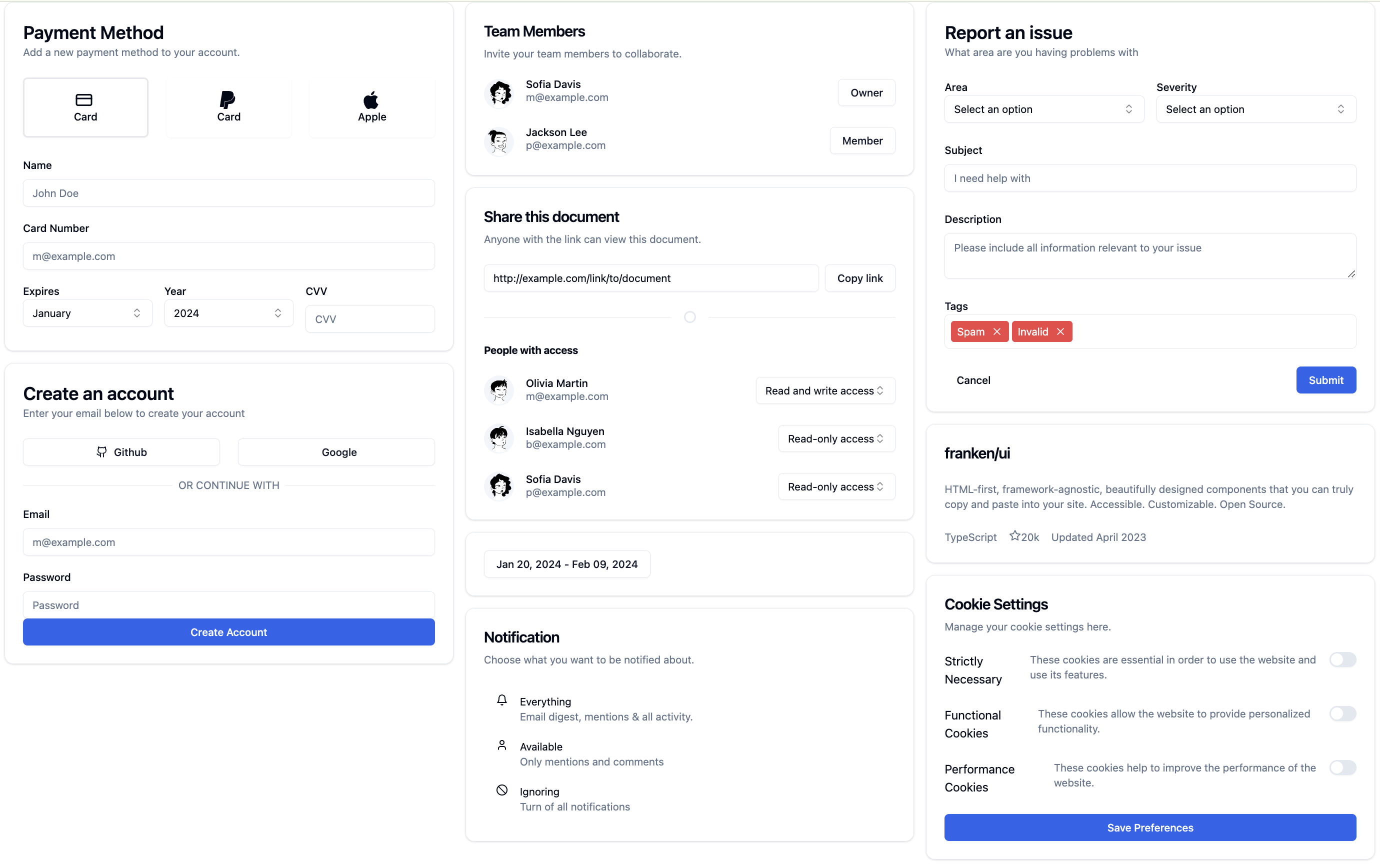
MonsterUI is a layer on top of FastHTML that provides pre-styled components and smart defaults based on modern libraries (such as Tailwind, FrankenUI, DaisyUI) while maintaining full access to Tailwind CSS when you need it. MonsterUI:
- Brings FastHTML’s simplicity to web styling.
- Provides beautiful, responsive components without writing a single CSS class.
- Lets you focus on building features instead of remembering utility classes.
Let’s learn by example with a card for team members:
def TeamCard(name, role, location="Remote"):
    icons = ("mail", "linkedin", "github")
    return Card(
        DivLAligned(
            DiceBearAvatar(name, h=24, w=24),
            Div(H3(name), P(role))),
        footer=DivFullySpaced(
            DivHStacked(UkIcon("map-pin", height=16), P(location)),
            DivHStacked(*(UkIconLink(icon, height=16) for icon in icons))))
I specified the entire layout, font sizing, icons, and avatar using only Python. I controlled everything without needing special flexbox or CSS class knowledge.

MonsterUI
dicebear_url = 'https://api.dicebear.com/8.x/lorelei/svg?seed=James Wilson'
Div(Div(Div(
    Span(Img(alt='Avatar', loading='lazy', src=dicebear_url,
             cls='aspect-square h-24 w-24'),cls='relative flex h-24 w-24 shrink-0 overflow-hidden rounded-full bg-accent'),
    Div(H3('James Wilson', cls='uk-h3'),
        P('Senior Developer')),
            cls='uk-flex uk-flex-left uk-flex-middle space-x-4'),
        cls='uk-card-body space-y-6'),
    Div(Div(Div(
                Uk_icon(icon='map-pin', height='16'),
                P('New York'),
                cls='uk-flex uk-flex-row uk-flex-middle space-x-4'),
            Div(A(Uk_icon(icon='mail', height='16'),href='#',cls='uk-icon-link'),
                A(Uk_icon(icon='linkedin', height='16'),href='#',cls='uk-icon-link'),
                A(Uk_icon(icon='github', height='16'),href='#',cls='uk-icon-link'),
                cls='uk-flex uk-flex-row uk-flex-middle space-x-4'),
            cls='uk-flex uk-flex-between uk-flex-middle uk-width-1-1'),
        cls='uk-card-footer'),
    cls='uk-card')
What MonsterUI does for you
MonsterUI is based on a simple principle: provide smart defaults while allowing full flexibility.
We’ve done this by builing upon proven approaches from some of the most innovative projects in modern web development, carefully selecting components that address the pain points of raw HTML/CSS while maintaining mature, battle-tested strategies.
MonsterUI’s core is FrankenUI, an innovative framework-free UI library by sveltecult that uses beautiful HTML-first components. FrankenUI itself was inspired by shadcn/ui by shadcn which pioneered the concept of copy-pasteable UI components for React.
Raw HTML and CSS present two key challenges: dated visual aesthetics and complex layout management. By combining FrankenUI’s framework-agnostic approach with FastHTML, MonsterUI delivers modern, beautiful components that integrate seamlessly with HTMX’s progressive enhancement paradigm - all while maintaining clean, readable code.
This isn’t just theory - we’re using MonsterUI in production for new applications we’re testing with preview customers, where it powers everything from complex dialog interfaces to dynamic content rendering. The library has been proven robust and maintainable in real-world enterprise settings.
Let’s explore some key features:
Theme
Pick a color theme for your app. There are 12 colors to choose from, each with a dark and a light mode. By default it uses the user’s system preferences.
All themes are synced so components look good on the same page regardless of whether the component is styled with FrankenUI, DaisyUI, or another framework.
Themes add the boilerplate needed to make color styling consistent throughout your app.
app, rt = fast_app(hdrs=Theme.blue.headers())Base Components
Every HTML element in MonsterUI comes with sensible default styling. A Button isn’t just an HTML button. It’s a styled component with hover states, focus rings, and consistent padding.
Button("Save Changes")MonsterUI provides data structures (ListT, TextT, ButtonT, etc.) for easy discoverability and tab completion for selecting styles.
For example, to style it with your Theme’s primary color, use ButtonT.primary. Primary colors are used for action buttons like “Add to Cart” or “Submit.”
Button("Add to Cart", cls=ButtonT.primary)Semantic Text Styles
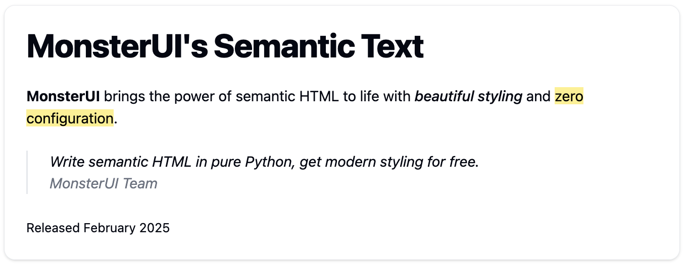
Build on the foundations of the web, MonsterUI styles semantic tags based on the HTML spec. This means that we have styled functions that match the themes that use standard HTML tags like emphasis (<em>), citation (<cite>), Marked (<mark>), small (<small>) and much more.
Card(
    H1("MonsterUI's Semantic Text"),
    P(
        Strong("MonsterUI"), " brings the power of semantic HTML to life with ",
        Em("beautiful styling"), " and ", Mark("zero configuration"), "."),
    Blockquote(
        P("Write semantic HTML in pure Python, get modern styling for free."),
        Cite("MonsterUI Team")),
    footer=Small("Released February 2025"),
)
Smart Layout Helpers
Overall page layout is made simple with the smart layout helpers (DivVStacked, DivCentered, DivFullySpaced, Grid, etc.). For example, DivVStacked stacks things vertically. Grid creates a grid in which to place components.
DivFullySpaced(
    H1("Dashboard"),
    DivRAligned(
        Button("Export", cls=ButtonT.secondary),
        Button("New Entry", cls=ButtonT.primary)))

# Grid layout with smart responsive columns for mobile vs desktop
# Easy args to customize responsiveness as you need
Grid(map(TeamCard, products), cols_max=3)
Note: See our layout tutorial for more details and advanced usage
Common UI Patterns
MonsterUI includes shortcuts for common UI patterns. For example, you almost always want an input text box to have a label to communicate what it’s for so we have provided LabelInput as a shortcut that creates a Label and Input pair..
LabelInput("Name", id='myid')You can use Div, FormLabel, and Input to do this yourself, but this pattern is so common we’ve provided a shortcut. Here’s what the shortcut replaces:
Div(FormLabel('Name', fr='myid'),
    Input(id='myid', name='myid'),
    cls='space-y-2')
Higher Level Components
We also provide helpers to generate more complex components such as navbars, modals, cards, and tables. Each of these is built on top of several base components (ModalContainer, ModalDialog, etc.) so you could build them up yourself. However, the helper function usually gives all the flexibility you need without needing to write your own boilerplate. These helper functions create good UX behavior for you such as automatically collapsing your NavBar into a hamburger menu on mobile.
For example to create a button that opens a modal:
Div(Button("Open Modal",uk_toggle="target: #my-modal" ),
    Modal(ModalTitle("Simple Test Modal"),
          P("With some somewhat brief content to show that it works!",
              cls=TextPresets.muted_sm),
          footer=ModalCloseButton("Close", cls=ButtonT.primary),id='my-modal'))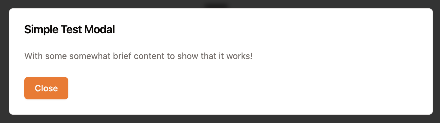
MonsterUI
Div(Button('Open Modal', type='button', uk_toggle='target: #my-modal',
           cls='uk-button uk-button-default'),
    Div(Div(Div(H2('Simple Test Modal', cls='uk-modal-title'),
                P('With some somewhat brief content to show that it works!',
                  cls='uk-text-muted uk-text-small'),
                cls='uk-modal-body space-y-6'),
            Div(Button('Close', type='button',
                       cls='uk-button uk-modal-close uk-button-primary'),
                cls='uk-modal-footer'),
            cls='uk-modal-dialog'),
        uk_modal=True,
        id='my-modal',
        cls='uk-modal uk-modal-container'))
Rendering Markdown
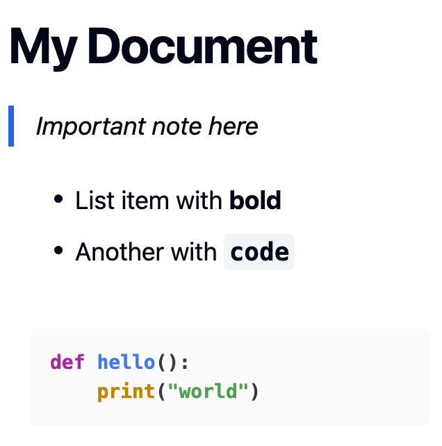
MonsterUI provides a render_md function that converts Markdown to styled HTML, with syntax highlighting via HighlightJS for code blocks, FrankenUI classes for styling, and Tailwind for additional styling and spacing. Here’s how to use it:
render_md("""
# My Document

> Important note here

+ List item with **bold**
+ Another with `code`

```python
def hello():
    print("world")
```
""")
Getting Started
First, install it using pip:
pip install MonsterUICreate a new FastHTML application with MonsterUI styling:
from fasthtml.common import *
from monsterui.all import *

# Choose a theme color (blue, green, red, etc)
hdrs = Theme.blue.headers()

# Create your app with the theme
app, rt = fast_app(hdrs=hdrs)

@rt
def index():
    socials = (('github','https://github.com/AnswerDotAI/MonsterUI'),
               ('twitter','https://twitter.com/isaac_flath/'),
               ('linkedin','https://www.linkedin.com/in/isaacflath/'))
    return Titled("Your First App",
        Card(
            H1("Welcome!"),
            P("Your first MonsterUI app", cls=TextPresets.muted_sm),
            P("I'm excited to see what you build with MonsterUI!"),
            footer=DivLAligned(*[UkIconLink(icon,href=url) for icon,url in socials])))

serve()
That’s it! You now have a styled application with zero configuration. The app already includes:
- Automatic dark/light mode based on user preferences
- Properly styled typography and spacing
- Responsive layout that works on all devices
- Beautiful UI components ready to use
- Synchronized color scheme with DaisyUI, FrankenUI, and Tailwind
Check out our documentation for more examples and component references.